PORTFOLIO
Click the work to see more!

Venco

Political party

Taskforce Dekkend Netwerk

Stoc

Funeral card

Logo for Dutch Design Weekend

Monogram

Leather mask

Lowpoly Jack Black

Double exposure

Poster dc Nightwing

Bureau In Graphic

Patchwork Studios

UNIT Festival


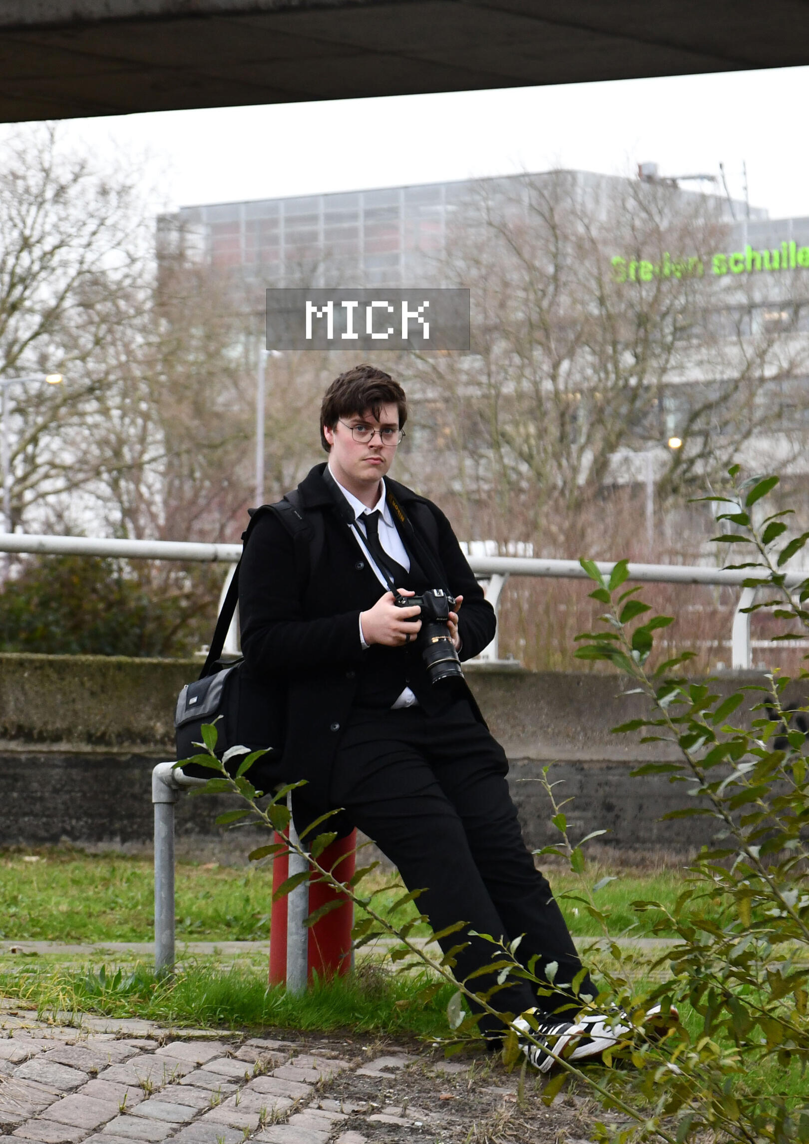
About me
I’m Mick Theunis, a graphic designer from the Netherlands who turns ideas into bold, clear visuals.I believe strong design starts with a solid concept. Looks matter, but meaning matters more. I studied at Grafisch Lyceum Rotterdam, where I specialized in Mixed Media and Branding.When I’m not designing, I’m lifting weights, playing volleyball, or leveling up in a video game. Different arenas, same focus: perform better every time.
Socials
Email: [email protected]
Venco

Poster 1

Mascotte

Poster 2

Instagram posts


I made these posters for school. The exercise was to choose an existing food brand and create promotions for it in another country. I chose to advertise Venco liquorice in Japan. I designed a mascot for the brand and designed him in several poses to use for my work. So I made 2 posters and 8 Instagram posts with the mascot. I decided on making the mascot very cartoony. I did this because, when I looked at advertisements in Japan with characters, they were all very cartoony. So I made mine very cartoony.
Political Party

Logo political party

Campaign poster


This was a group exercise. We made a new political party. We created a new political party. My role in this exercise was to design the logo for our party, along with the slogan and a campaign poster. I designed the logo this way because our party stands for unity and collaboration towards a better future. Therefore, I created a logo featuring four hands holding each other. In the center of the hands, I designed an image of two arrows pointing towards each other, resembling an infinity sign. This symbolizes the concept of everyone helping each other. For the campaign poster I went for a simple design. I selected a picture of two hands holding each other. I reviewed many pictures to find the right one with the appropriate personality. I chose this one because of the angle of the arms and the small tattoo on the arm. I placed the logo between the arms, giving the impression that the arms are holding the logo together. For the typography, I decided to color the words 'together' and 'future' and underline them to make them stand out more.
Taskforce Dekkend Netwerk

Logo TDN

Template TDN


This is a logo I created for a new startup company that is working to improve the education system. Aiming to make support for mental disabilities like ADHD, dyslexia, and autism more accessible. I designed the logo this way because the two white parts resemble abstract hands. I used the colors blue and green because they represent freshness and peace. For the business card and letterhead, I opted for a design that is both playful and professional.
Stoc

Mock up mechandise

Logo Stoc

Mockup letter, envelope, business card

Sketches Logo


This is something I made for an own made up industry. I called it Stoc and it's a paint/graffiti shop. I decided on the logo with the animal a frog. They come in many different colors. many different sizes. They are simply versatile and that's why I thought it was the right pick for my industry. For the paper and the envelope I decided on something a bit exciting and busy.
Funeral card

Front and back side

Inside of the card

Bookmark

The bird


This is a funeral card I made for my grandma. The idea behind the bird is that it is flying through a canvas. As if flying out a window. The deeper meaning of it is basically the soul being freed from the body. I kept it very simple for a nice and classic design. On the inside of the card I let the canvas stay on the left page and the bird on the right page. On the inside there is also a bookmark with a poem on it, and on the back there is a link to a charity website.
Dutch Design Weekend

Style guide Dutch Design Weekend

Logo Dutch Design Weekend

Poster Dutch Design Weekend


This is all I designed for the Dutch Design Weekend. I chose for a chameleon as the character for my logo. They change color and become something they want to be. Like artist they create art in the way they want, they show their perspective of the world through their art. I chose two different fonts that are very different, again to show the difference in the people that show their work. The color green stands for freshness and balance.
Monogram

Monogram

Sketches Monogram


This is a monogram I made of my name. I decided to you use the T in my name as a sword imbedded in the M. I let the M wrap around the T to create more depth in the picture.
Leather mask

Template 1

Template 2

Template put together

Template put together

Leather cut out

AWL work

Finished mask 1

Finished mask 2

Finished mask 3


This is a leather mask I made. Firstly I found went looking for masks online to see what kind of mask I wanted to create. I found this template that I redesigned to make it my own. Then I started playing with the size of the template and printing it, then putting it together to see if it was the right size. After I found a size I was happy with I started to tape the template on my leather to cut it out. When everything was cut out I used an awl to make the holes so I could sow it all together. Lastly when everything was sown together and the straps on the back were added onto it this came out.
Lowpoly

Lowpoly Jack Black

This is a lowpoly I made of Jack Black. I just grabbed a picture and outlined him in illustrator. Then I just made a lot of tiny triangles and color picked the picture per triangle.
Double Exposure

Double exposure

This is a double exposure I made. I grabbed the number 5 and put Indonesian rice fields in there. I used a brush to expand the mask to let all the plant life sprout out of the five. I also added a shadow to give it a little more character.
Poster DC Nightwing

Poster

This is a poster I made of Nightwing. I gave the background that old comic feel and a strong font to the title.
Bureau In Graphic

9 posts to make visual

Merchandise

Promotion sticker

Factuur


For this exercise I made my own company. This company is a design bureau called BIG which stands for Bureau In Graphic. The idea behind this company was that you could hire their services to let them design for your socials to design a corporate identity and stuff like that. To promote the company I made a cap which we would give out at a big market for new company's, a sticker which again we could give away and lastly i made 9 Instagram posts which if you look at the overview make one big circle. Each post has a word in it that describes the company.
Patchwork Studios

Initial design choices

Color options

End Logo design

Styleguide


This is another company I made up and designed everything for. This company is called Patchwork Studios, It's a game studio that works together with smaller indie company's to get them on the market. So basically the idea of this company is that the gaming market is mostly run by the triple A game company's. My company would help small indie creator's to help them make their dreams come true. My company would provide the resources to basically give the creator a small team to help them create. For my logo's I had the idea for three different design's. The first one was like a start screen for an old game. The second idea was a loading bar to also just kind of get that idea of something not being completely done where my company would help them finish it. The last design was basically a chip with different connections going all over the place to get that feel of working together. I eventually chose for the second design because that simply spoke the most to me plus i also saw an idea for an advertisement. The next stage was figuring out what colors I wanted to use. I did know I wanted to use some bright neon colors to get a bit of a laser tag/ arcade feeling. In the end I landed on this pinkish purple. lastly to promote my new company I made two advertisement videos. Both differing a lot from each other. One I made very poppy in your face and the other a little mysterious.
UNIT Festival

bar

bar outline

bar almost fin

bar fin

mal gaas

gaas fin


